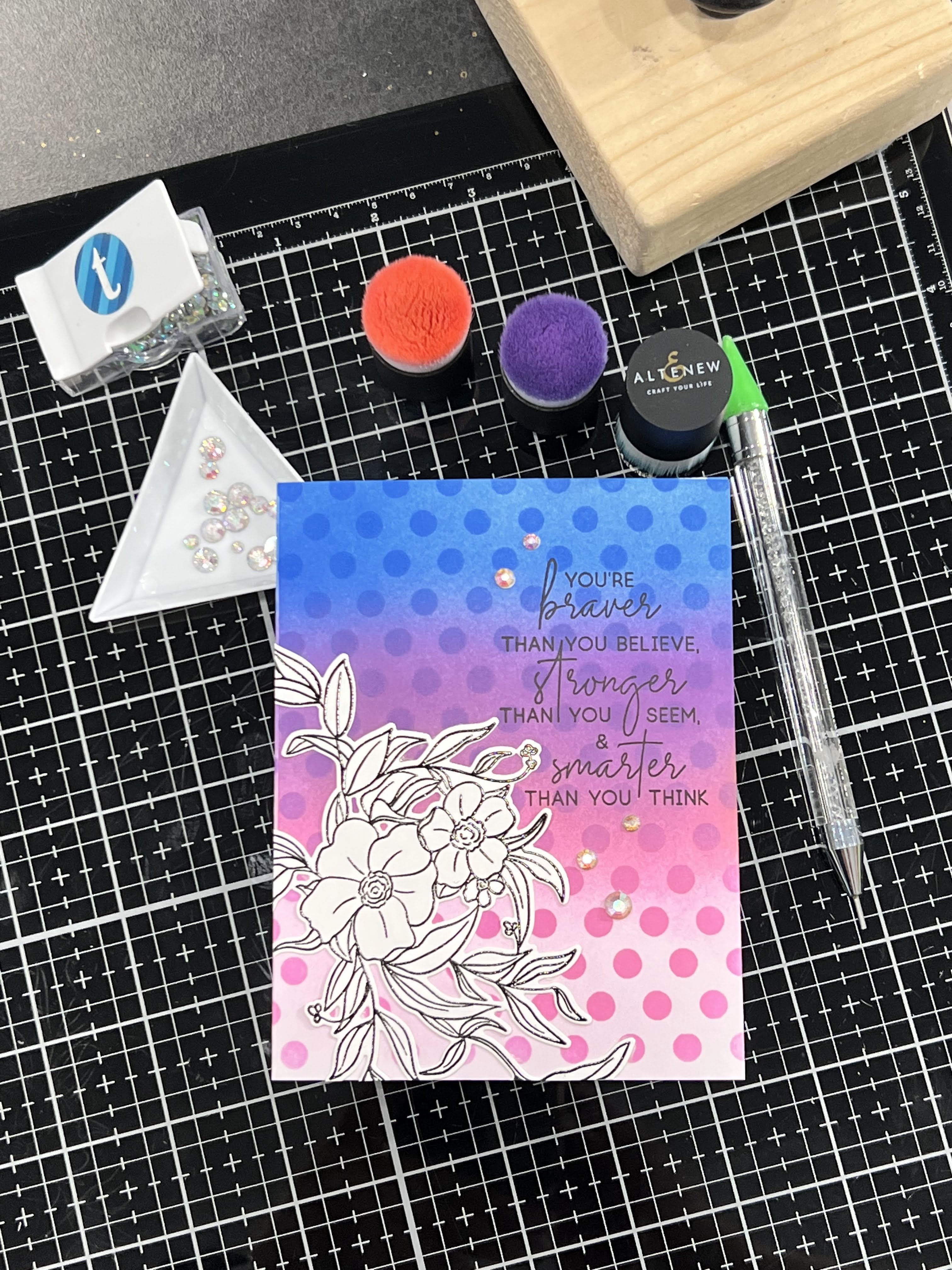
Lesson 6 is all about ink blending! If I had to pick, I’d be forced to admit that it’s one of my favourite techniques. I love colour and ink and the endless fun and combinations of looks you can get with them. Add in a fun stencil, a great sentiment, a pretty floral accent, some sparkle, and you have a recipe for a bright fun card!
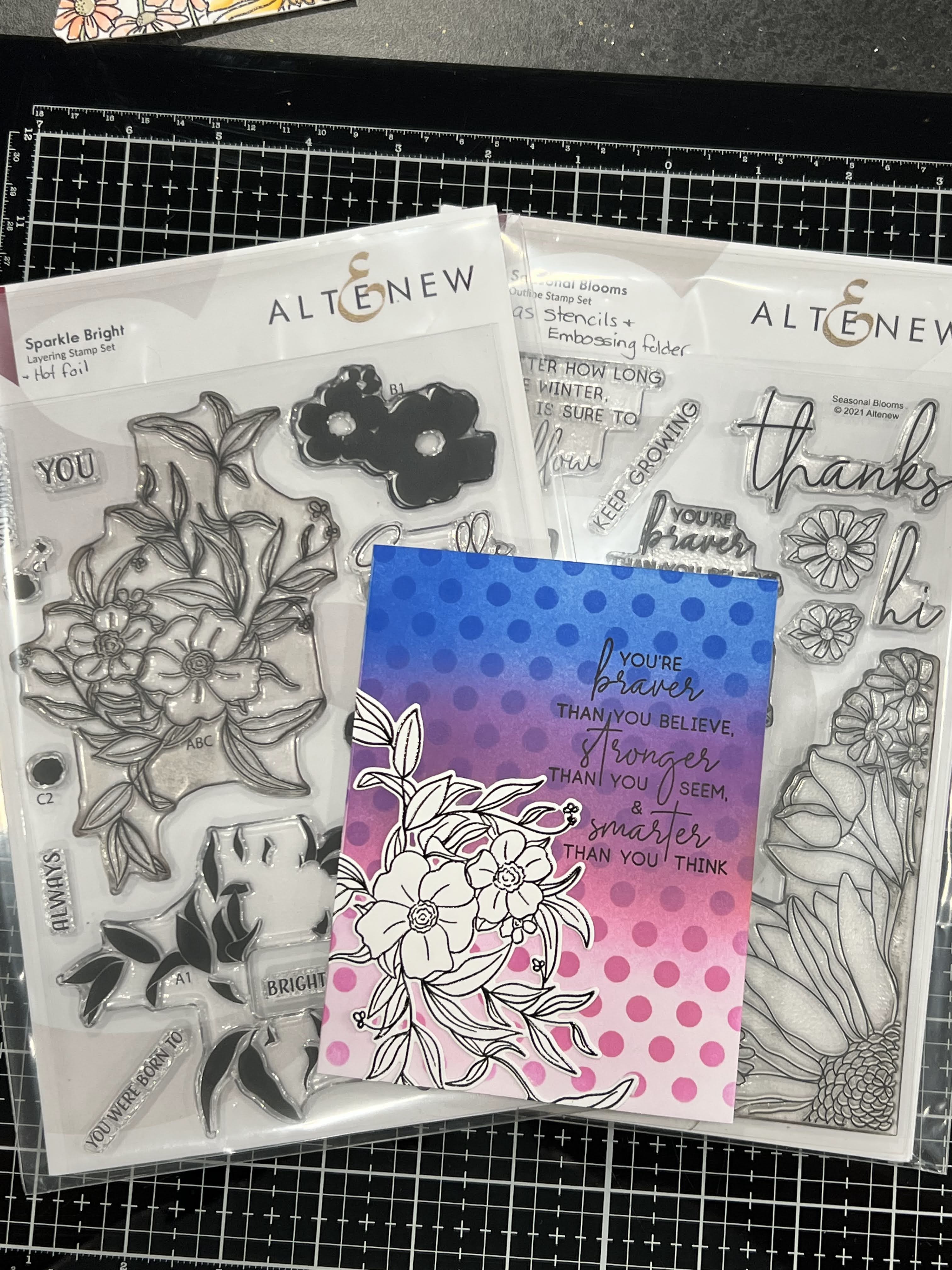
Using the Sparkle Bright stamp, die & stencil set and combing it with the Altenew Halftone Stencil and a sentiment from the Seasonal Blooms Bundle gave a fun card that makes the colours really pop. First I ink blended an A2 Top folding card front lightly with Ultramarine, then Deep Iris & Pinkalicious. I laid the stencil over top using only the larger dots and blended the same colours through it with a heavier hand and slightly overlapping onto the next colour for a blend.
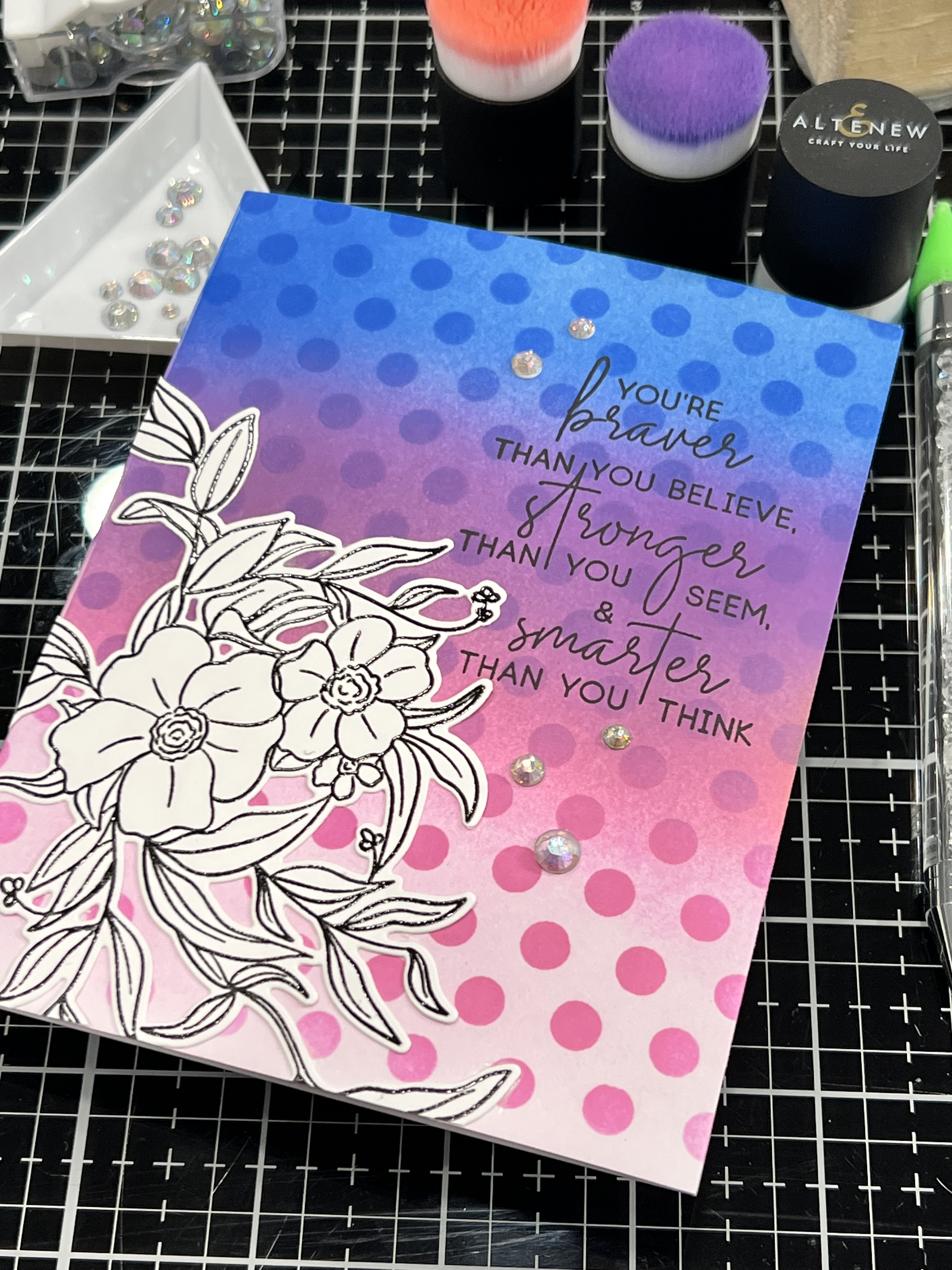
I decided to do a black and white floral to show off the colours and ink blending. I didn’t want the focus to be too divided by extra colours. The simplicity of the floral shows the detail in the stamp set without taking anything away from its lovely design. Using a few clear sparkling gems to avoid adding more colour helps balance the black and white floral as well.

Lovely, I’d never think to do black and white outline over colour, adding it to my list 🙂
LikeLiked by 1 person
Thanks! I thought it helped the colours to be more impactful 🙂
LikeLike
This is amazing! I love doing black and white outline images on coloured backgrounds!! Thank you for sharing!
LikeLiked by 1 person
Thank you! I think this is one of my favourite cards from the Level 1 class 😊
LikeLike